So, let’s see how Corel AfterShot Pro 3 really stacks up, not just in terms of speed, but also for ease of use and wealth of features.
What are AfterShot Pro 3 and Lightroom?
AfterShot Pro 3 and Lightroom are image-editing software. And looking at the many different ones out there, it’s easy to see how they both fall into one of two groups. There are the heavy hitters, who have all the advanced tools but a slower workflow. Photoshop and Capture One are great examples of these. Then, there are the lightweights. They process images faster than a butterfly moves but lack the more complex post-processing tools. Corel’s AfterShot Pro 3, Adobe Lightroom and ON1 Photo RAW fall into this category.
Faster, Less Complex Editing Software
The lightweights go for speed rather than advanced editing. And there’s nothing wrong with that. I prefer a faster workflow compared to more complex adjustments, too. Because of this, the main competitors of AfterShot Pro 3 are Adobe Lightroom, ON1 Photo RAW, Darktable and Rawtherapee. Although, the first three have introduced some more advanced features you find in Photoshop like masks and layers, and the last two listed are free. In the end, you may possibly use both types of programs. You might use the heavyweights for layers, masks, focus stacking and other complex edits. And you can use lightweight software like AfterShot Pro 3 and Lightroom for culling and local adjustments.
Comparing AfterShot Pro 3 to Lightroom
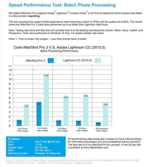
On AfterShot’s website, there is a comparison of AfterShot Pro 3 against Lightroom CC and Lightroom 6. It is great to have. You can see quickly what AfterShot gives you, and where Lightroom fails. But its information is a bit outdated. Also, Lightroom CC is not necessarily the direct competitor of AfterShot Pro 3. I see it as the basic, beginner’s version of Lightroom, based around their mobile app. Lightroom CC is meant to give mobile and tablet-based photo editors access to desktop editing. So, Aftersthot is comparing themselves to a basic and inferior product. If AfterShot Pro 3 were to compare themselves to any program, it should be Lightroom Classic. They perhaps didn’t do this, because their product doesn’t hold up so well to the fuller version. They also make a comparison to Lightroom 6 to compare perpetual licenses. But Lightroom 6 is no longer available. The problem with comparing yourself to Lightroom is that it forces the new editing software to copy and act in the same vein. With AfterShot Pro 3, it’s a little too similar. Why not concentrate on an engine that focuses on something different or better? I understand the main benefit of AfterShot is that it is much faster than Lightroom. But is that enough?
User Experience with AfterShot Pro 3
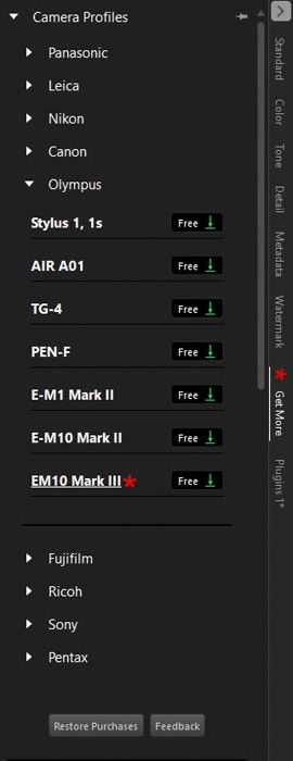
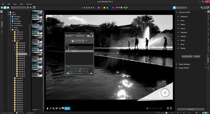
If this is your first entrance into photo editing software, you might like the interface. But I find the interface not as attractive or easy on the eyes as its competitors. There are many things I find that don’t fit well. Number one is they left the Windows-style folder icons and colors in the File System on the left. They are horrible and distracting. At the very least, they need to be muted, or, even better, adapted to fit into the same theme as the program. Adobe Lightroom created its own icons, which are not over the top. I feel like Aftershot 3 Pro was a little lazy here. The file system itself works, but it’s very basic. It isn’t fun to use. The next thing I find distracting is the terrible colors at the top of the window interface. These colors are labels and can be added to your images to separate in your culling or selection process. They don’t need to be so over the top though. Next is that red star icon in the middle of the far-right of the interface window. It is supposed to bring your eye to the ‘Get More’ Modular Camera Profiles, but why? This isn’t the most important area to draw your attention to. Camera Profiles aren’t as useful as the exposure slider or are so hidden that it needs to be pointed out. Saying that, I like the simple window. Everything happens here. Unlike Lightroom and ON1 Photo Raw which use modules, AfterShot Pro 3 uses tabs. They are easy to navigate and use. There aren’t so many they become confusing. The only thing I had a problem with, was trying to figure out how to paint in local adjustments. It wasn’t obvious.
Workflow
There are many similarities between AfterShot Pro 3 and other editing software. For one, they allow the same workflow, from import to export. It’s an end-to-end solution that takes your image through sorting and editing all the way to printing. Exposure, white balance, saturation and contrast are all present, giving you control over your images. Like Lightroom, you also have the capacity to change the color balance. Sharpening and noise removal work well, but fall short when compared to Lightroom. You can use presets, access a library of plugins and edit metadata. Keywords are also useful. AfterShot Pro 3 does have its own workflow. It is set up in a way that it feels a little odd, but it will grow on you if given time and patience. The big difference with AfterShot Pro 3 is that your images aren’t imported into a database. It doesn’t keep all of the changes you make in one catalog, which is the case in Lightroom. You first need to import your images to your desktop or hard drive. This program won’t do it for you. Like other programs, such as On1 Photo Raw, all the changes are stored in XMP files. This is handy if the files become corrupt or lost. It means every other edit is safe. It also allows you to transfer and share images across platforms much better than LR. This workflow really fits those who work in a collaborative field. Edits can be passed along with raw files easily, retaining all of the edits.
Speed and Responsivity
Lightroom works by using modules. The Library Module is where all of the file organization happens. The Develop Module allows you to edit your images. This can be slow if you need to flick amongst them to edit and rework your image. In AfterShot Pro 3, everything takes place in one window, making it faster in comparison. This will depend on your workflow and how you process your images. I personally find Lightroom fast for what I want to do. It can take a long time to import images with Smart Previews. But it lets you work while it does it in the background. The downloaded package takes up just over a quarter of what Lightroom takes up. This is a benefit for all those travel photographers, working on older or weaker laptops. It works well on one screen whereas Lightroom really needs dual monitors for the best experience. You can’t use two monitors with AfterShot Pro 3, as there is no support for it.
File Organization
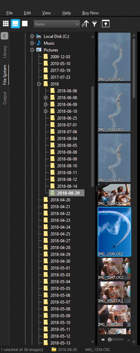
If you love the file organization structure of Lightroom, you might be confused by the file management system of AfterShot Pro 3. One reason AfterShot is faster is that it doesn’t pull your images into the program’s catalog system. It lets you find the images wherever they are on your system. In Lightroom’s defence, it makes keyword searching much faster. It also lets you edit images that are currently offline, due to an unplugged hard drive. You don’t need your images to actually edit them. AfterShot is faster if you don’t need to keyword search or use more than just simple adjustments. If you want to, you can create a catalog within AfterShot. That will help if you’re missing Lightroom.
Camera & Lens Profiles
AfterShot Pro came about when Corel acquired Bibble Labs in 2012. It was a direct descendant of Bibble 5 Pro. Because of this pre-existing software, Corel had access to over 200 camera and lens profiles. Canon, Nikon, Olympus – all of the big names are present. There are almost 100 camera and 300 lens profiles to choose from in total. More and more are being added with each update. There is even a section that allows you to request a specific profile, where those over at Corel will get on it immediately. This is a great system unless you need to wait a long time for each update or profile addition. It would be impossibly time-consuming to add every single camera and lens the world has to offer. If you don’t find a profile that matches your equipment, you can always lens correct manually.
Raw Processing
AfterShot Pro 3 and Lightroom Classic CC 2019 render raw images differently. Lightroom uses an algorithm by Adobe Camera RAW (ACR) images. The colors are slightly dampened and usually have less tonal range. But it appears to function the best alongside Canon raw images. On the other hand, AfterShot Pro uses its own algorithm to render raw photos. This is very brave and very worthy as many programs use the same DCRaw engine. Many photographers have a problem with the inferior quality of raw processing compared to Lightroom. For now, Lightroom’s raw processor is stronger, but that is subject to change.
Layers
There is one aspect in AfterShot Pro 3 that makes it stand out from the competition. This is the intuitive layers area, found towards the top right of the window. You can apply any number of edits. You can change the tint, hue, curves of any part of an image and stash them in a single layer. More and more layers can be added, housing as many or as few edits as you wish. I found this to be very beneficial, and a great way of keeping track of what you adjusted. Lightroom does allow local adjustments, but not in the same way. Compared to AfterShot Pro 3, Lightroom makes it complicated to know what adjustment does what.
Performance
I wanted to start this section off with something positive, but as I was looking through my files, the program quit. The problem was that my computer has many folders within folders that hold my images. The problem with a browse rather than library model is that you rely on your computer more. The library model followed by Lightroom plays more on your computer’s memory. AfterShot Pro 3 performs pretty well when using basic adjustments or even layers. The previews for the changes you make with the exposure, contrast or other sliders do appear a little choppy.
Highlight Recovery
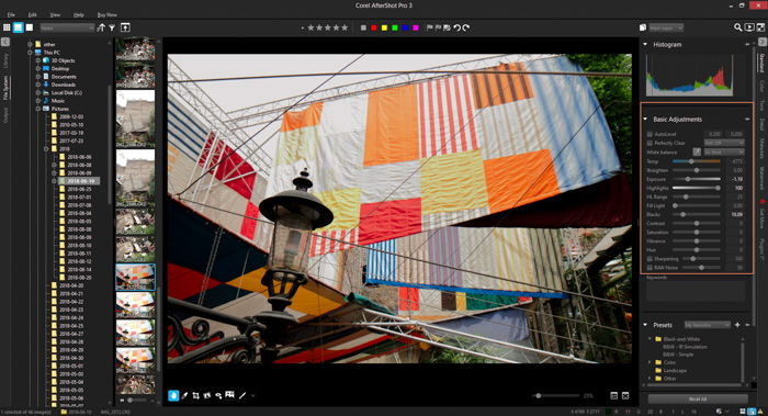
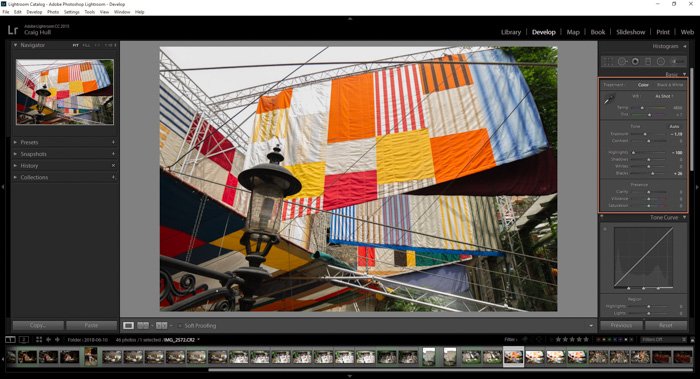
I did a test looking at the highlight recovery. After all, they claim an enhanced highlight recovery. My findings were less than impressive and made Lightroom look even more attractive. Here is the image I used. As you can see, the highlights are very blown out. I brought the image into AfterShot Pro 3, brought the Highlights down as far as they could go, reduced the Exposure by -1.19 and even added some blacks. By using the same values, I edited the image in Lightroom Classic CC. The recovery was much better than what I had felt in AfterShot Pro 3. I was also able to retain truer whites and a better overall image. Generally, I found Lightroom Classic CC to be better than AfterShot Pro 3 in almost everything I need from an editing program. It basically comes down to speed and the size of the program. Both are smaller with AfterShot. But the speed test came down to a few seconds. If I am working with many images that hold huge amounts of data, it will be slow. So, I take this into account in my workflow. If after a shoot I have 500+ raw images, I import them into Lightroom Classic CC 2019, add keywords, metadata and little blanket adjustments. Then I leave it alone while it imports. It might take an hour, but I am left with images I can work with quickly. I don’t even have to have my hard drives plugged in to edit them. AfterShot Pro 3 doesn’t have enough to be a competitor to Lightroom. Were it free, it would have been a better contender against Darktable or RawTherapee.
Pricing
AfterShot Pro 3 will point out it is cheaper than Lightroom CC or Classic CC. Most programs focus on this, ensuring it falls just under their price, hoping to snag those who want something cheaper. From reading a few reviews and researching further, AfterShot Pro seems to be on discount often. Currently, there is a 40% discount price on its $90 tag. These $90 give you a perpetual licence, meaning the cost is the same spread over one month or three years. This is great for beginner photographers or hobbyists. Lightroom, on the other hand, is expensive in comparison. Their annoying subscription model charges you $10 a month. Over three years, the total cost will reach $360. Under the subscription, you do get updates within the price and all the free presets (if you can find them) you want. There are also other plug-ins, and programs, such as LRTimelapse you can use. For free. With AfterShot Pro 3, the hidden prices are in the plug-ins. You can pay up to $18 just for one. Obtaining all of them will cost more than the program. For the same price package, you get Adobe Photoshop, Lightroom Classic, and Lightroom CC. All of these for $10 a month. When you pay $10 a month, you do get three Adobe programs, Adobe Photoshop CC, Lightroom CC and Lightroom Classic CC. You also get Creative Cloud storage – how much depends on the package you choose.
AfterShot Pro 3 Review: Pros and Cons
Pros
No subscription fee Intuitive layers Ease of use compact one-window editing Fast processes No need for importing
Cons
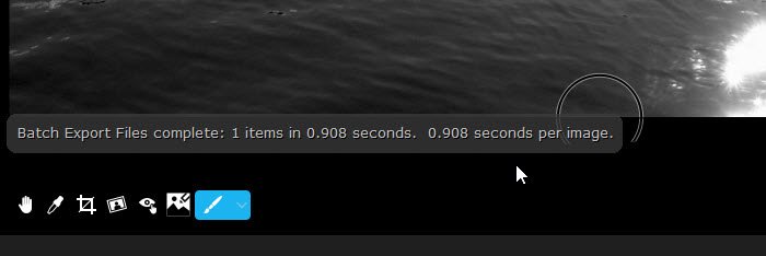
No in-program tutorial Few UI issues Preset packs are expensive Processing times are shown (This goes a little too far. AfterShot really wants to show they are the fastest, shown with regular pop-ups on how long a certain process takes.)
Why Use AfterShot 3 Pro?
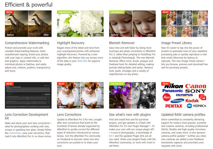
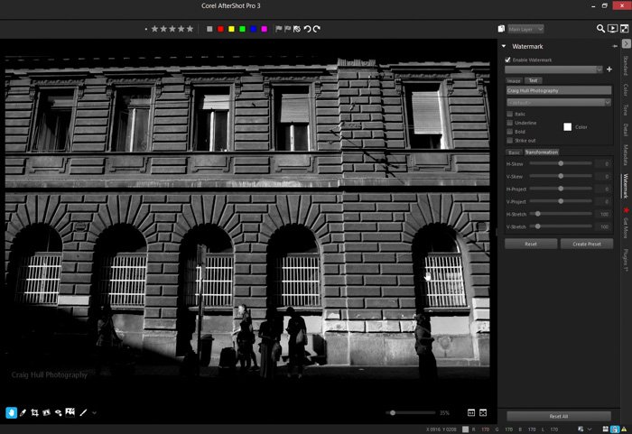
One huge reason why you should use Corel’s AfterShot Pro 3 is its Enhanced Highlight Recovery. Something like this is beneficial to beginner and professional photographers. Other reasons you should use this software are its powerful Batch Processing, Blemish Remover and its Modular Camera Profiles functions. And you should also look at the cost. This is where AfterShot Pro 3 wins. It’s $80. This is the total cost, and the license is perpetual. This alone kicks Adobe and their subscription’s butt. With AfterShot, you are free to use it for the next three years. This is perfect for beginner or hobbyist photographers. One issue I had with AfterShot Pro 3 was their focus on watermarks. The first impression I got of their website was the NEW Comprehensive Watermarking, plastered all over their front page. I do understand that many photographers are worried about their content not being properly accredited, or stolen and used elsewhere. Yet, watermarks don’t really stop this 100%. Yet, it shouldn’t be any company’s main selling point. There are many other good things about AfterShot 3 Pro, as mentioned above, but I don’t think AfterShot’s watermarks are the best selling point, neither are they amazing. Watermarks are not difficult to do, nor are they the main reason why photographers purchase or use editing software. And if your work is good enough to need a watermark, you are most likely already using photo editing software. It is very rare to get amazing images SOOC (straight out of camera). Also, I’m pretty sure you can add watermarks in most if not all editing software packages.
Conclusion
It’s no surprise that Lightroom is at the top of the ladder. It is fast, capable and looks sleek. On top of that, they integrated panoramic and HDR modes, allowing many photographers to skip Photoshop. Everyone likes to complain about Adobe’s subscription model. And I do understand it. It was likely to combat the many free downloads users enjoyed at the time of P2P sharing. When a company releases software, it has pumped a lot of money into research, development, design and testing. They need to see a profit. That’s how a company survives. Adobe has been the flag bearer of editing software for a long time, and it doesn’t feel like it will change anytime soon. I like that more and more programs are being born with a mixture of Photoshop and Lightroom combined. For that, there is a market. We do not need more sub-par programs that don’t do the job well. For me, AfterShot Pro 3 was OK. I could do most things I wanted to do. However, I doubt I could really compare it to Lightroom. The speed difference, which is minute, isn’t enough to sway me. Corel, the guys behind this program, focus so much attention on being better than Lightroom, it does them a disservice. They should focus on what people want. It isn’t paying for extras. In a world of loot boxes and costly plug-ins, AfterShot Pro 3 falls into the category of free-to-play, but you need to spend more to get ahead. We are already tired of it. If you aren’t making huge adjustments to your images, don’t need to pull magic from images that don’t quite make the cut, this is for you. For the rest of us, Lightroom will continue to lead the way.
